

What is Responsive Design
20 07, 15 | 05:51 Filed in: Website Design
An Introduction to Responsive Web Design
Responsive web design… You may have heard this term when looking for a website. Maybe some web designers talk to you about responsive design and others don’t.
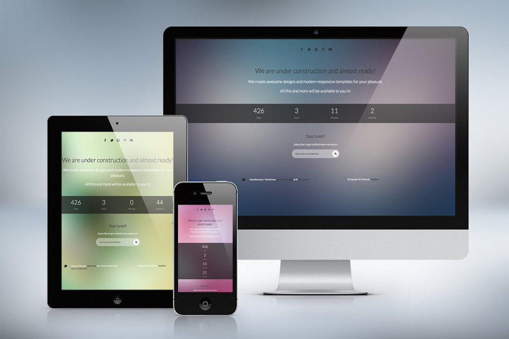
What is responsive web design? A responsive website design is one that “responds” to the size of your screen. These days there are a tremendous number of different screen resolutions. From the occasional flip phone to tablets, to netbooks to laptops / desktop computers. And a website needs to look good on any device. So a web design that changes shape to fit the size of the screen is a great way to go.
The way a responsive design works is that the screen resolutions are returned to the website programming, generally through the CSS file. Depending on the resolution, the layout of the website elements will change (eg a banner will shrink to fit the screen width, or the number of columns will reduce and start to stack vertically). What you end up is something that looks good – no matter what device you are viewing the website on.
Responsive Web Design vs Mobile Design: A mobile website is good, however, the same can be done with a responsive design. With a mobile website, you have a separate entity, a second website apart from the full sized design. However, this means that the designer needs to build two different websites. With a responsive design, only one web design is required. Different web elements can be changed and removed for the smaller layouts. Now an app is different. A web app is meant for a specific function. It is a program loaded onto your device. You could have an app plus a responsive web design.
Conclusion:
Well, responsive web design is here to stay. And I believe it is the best option for any website out there.